BFLAT BRIO DESIGN
BFlat Brio is a newly furnished Airbnb in Nashville’s West End. The condo rental needed a logo to represent its new name and ownership. BFlat Brio caters to parties vacationing in Music City looking for an upscale feel.
The logo I designed stays true to the music ties that the city is known for and also brings in the lavish atmosphere of the flat itself. Its design also takes into consideration scalability and can be used with or without the wordmark depending on the use case.


CAPITAL ONE REDESIGN
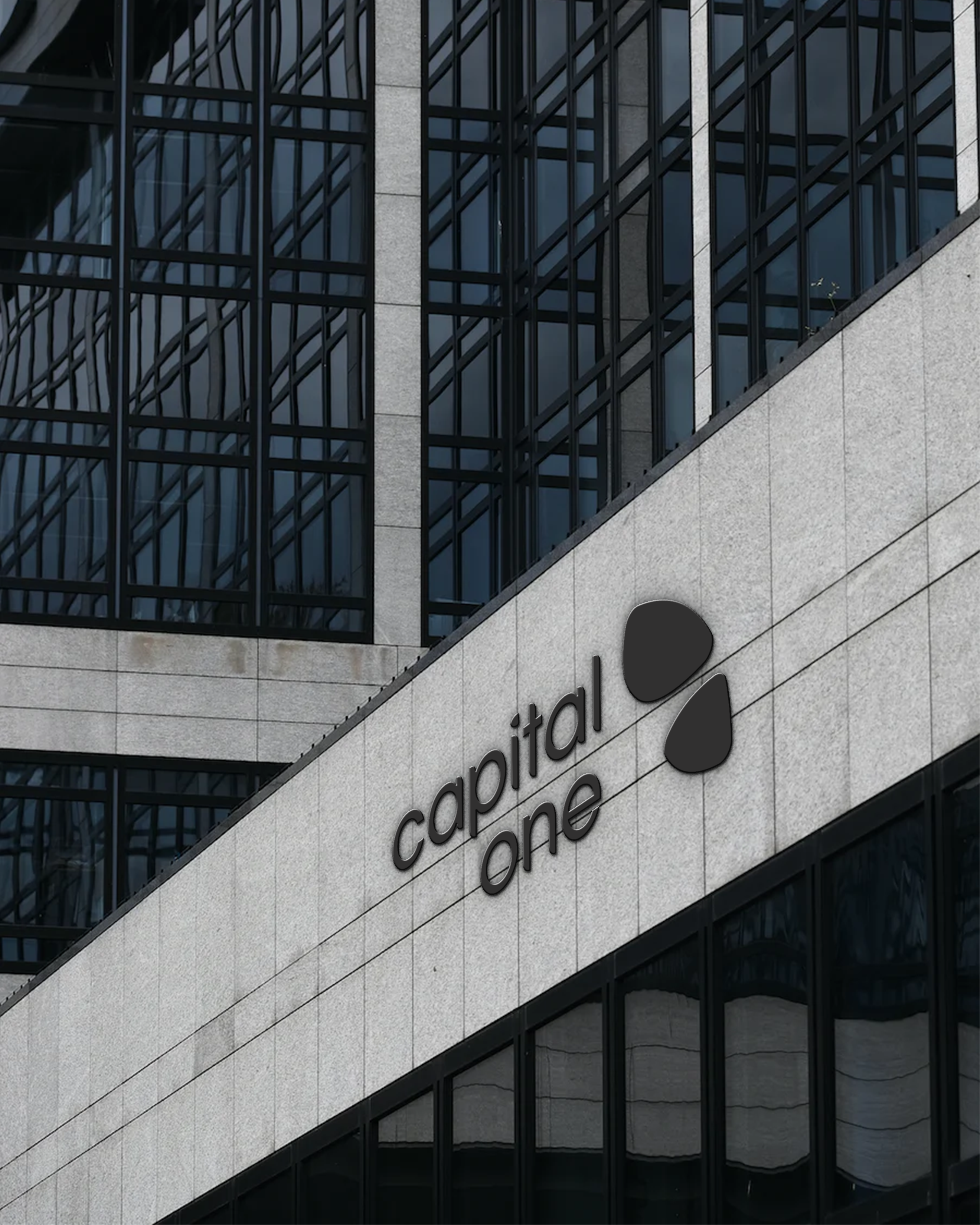
Capital One’s bland, dated red swoop and mismatching fonts needed to go. The banking company requires a modern mark that draws from the strengths of the present but also steps forward into the future and has the ability to grow with the company.
The logo I created maintains the same recognizable color scheme and applies it to the cardinal, a symbol for “doing the right thing,” one of Capital One’s core values. It is also more versatile; my design includes a logomark that can be used independent from the full lockup, something that wasn't possible before. The new logo can be used in all settings from signs and billboards to tiny app icons and web browser tabs.



LIPSCOMB ROCKETRY LOGO
The Lipscomb rocketry team was looking to blast off into the new school year with a fresh look. The new logo needed to express the team's dedication to excellence. I created two triangular starburst shapes pointing upwards and paired them with a clean yet tech-inspired font as to not overdo the space theme and keep the logo looking professional.


